All work

theClass

Designing a calm, honest website for one-to-one online English tutoring, where the price and the next step are never more than a scroll away.

theclass.space
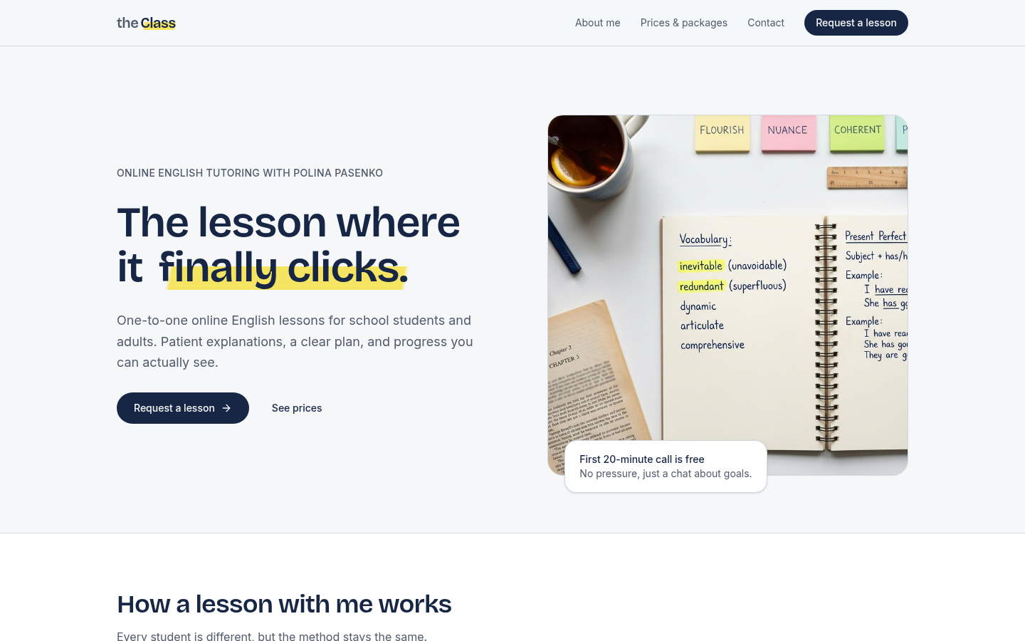
theClass home page with the headline The lesson where it finally clicks.
Client
Polina Pasenko, English tutor
Role
UX & UI design, build
Pages
Home, About me, Prices & packages, Contact
Tools
Framer, Figma

Tutoring is sold on trust. Most tutor websites make you ask for it.

Polina teaches English one-to-one, online, to school students and adults. She needed a site that explains how her lessons work, shows what they cost, and turns interest into a lesson request. I designed and built theClass end to end, from the brief to a live site with a working request form at theclass.space.

Research: what does a parent need to see before they reach out?

  • 1

    Client brief

    A landing page with About me, Prices & packages, Contact, and a request form.

  • 6

    Tutor sites audited

    Independent tutors and small tutoring agencies, desktop and mobile.

  • 2

    Audiences

    Parents booking for school students, and adults coming back to English.

Key insights

I compared the brief with what competing sites did well and badly, and grouped the gaps into four themes.

  1. 1

    Prices hidden behind “get in touch” made parents leave before they ever asked.

  2. 2

    Generic multi-subject templates made it unclear what the tutor actually taught.

  3. 3

    Parents wanted to see the method and how progress is reported, not just credentials.

  4. 4

    Long booking forms with fields that didn’t apply added friction before the first conversation.

One persona and one clear problem to solve.

Persona

Marta, 41

Parent of a 14-year-old, Toronto

“His English grades dropped and I don’t really know why. I want someone patient who can explain things, and I want to know what it costs before I call anyone.”

Goals

A patient tutor, a clear plan, regular updates on progress.

Frustrations

Hidden prices, vague methods, long forms, slow replies.
How might we

…help a worried parent understand the method, the price, and the next step in under a minute?

  • Show the prices on the home page
  • Explain a lesson in three plain steps
  • Keep the request form short and specific

Information architecture and the main user flow.

  1. Home
  2. How a lesson works
  3. Prices & packages
  4. About me
  5. Request form
  6. Reply within a day

Four pages, one action

Home, About me, Prices & packages, and Contact. Every page ends with the same “Request a lesson” button, so there is never a dead end.

Pricing as a ladder

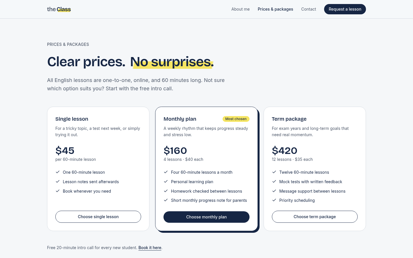
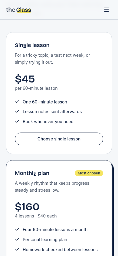
$45 single, $160 monthly, $420 per term. The more regular the lessons, the less each costs, and the middle plan is marked “Most chosen”.

A form that asks only what matters

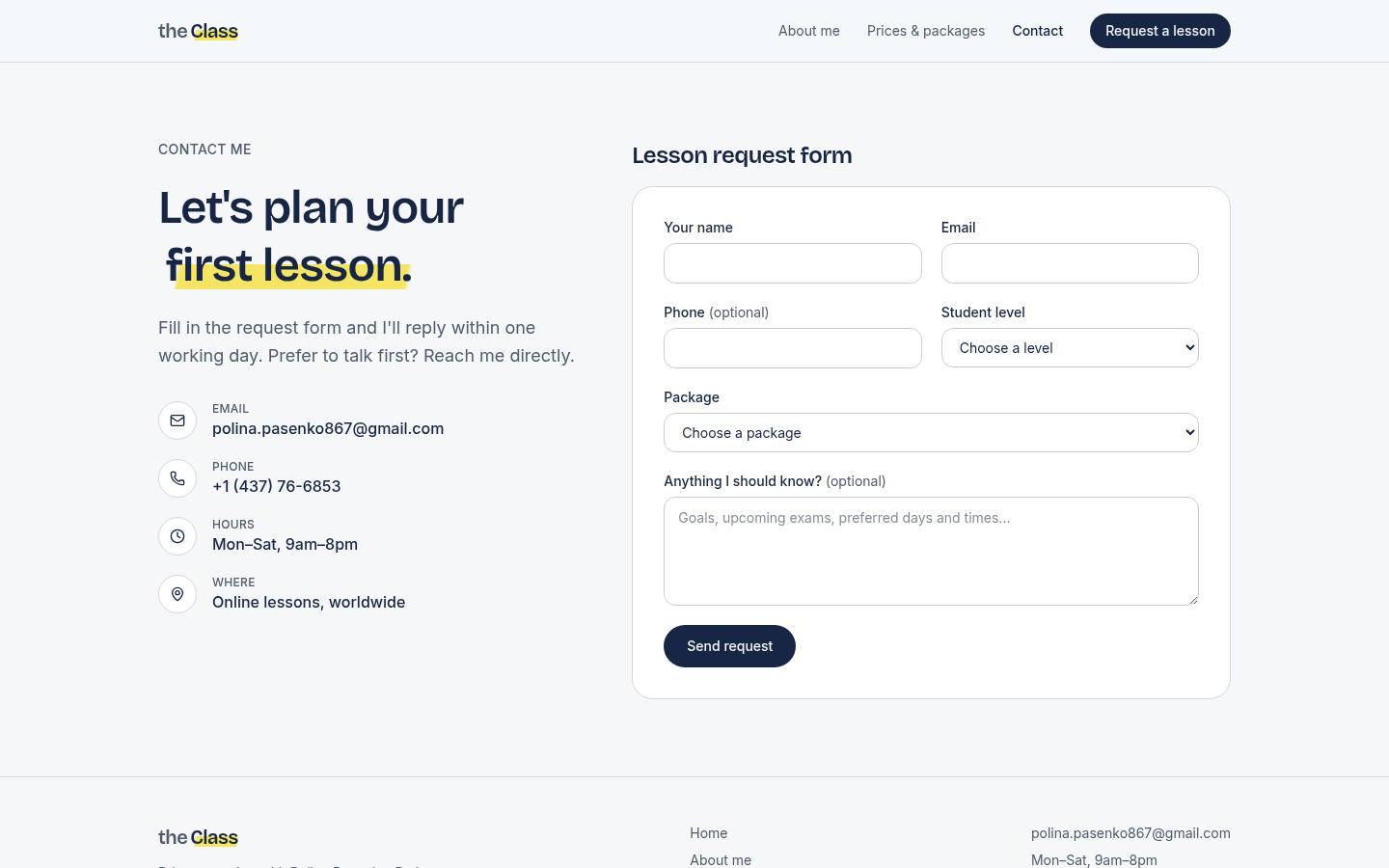
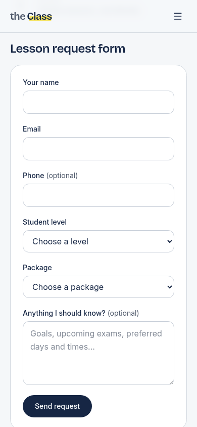
Name, email, optional phone, level, package, and notes. Each request is validated and saved to a Neon Postgres database.

A notebook system: ink, paper, and one highlighter.

Paper

#F5F7FA

Ink

#1B2547

Highlighter

#F4E26A

Type & highlight

Aa Aa

Bricolage Grotesque for headings feels warm without looking childish; Inter keeps prices and form labels easy to read. A single highlighter stroke marks one phrase per page and is the only decoration.

About & prices: answer the first two questions

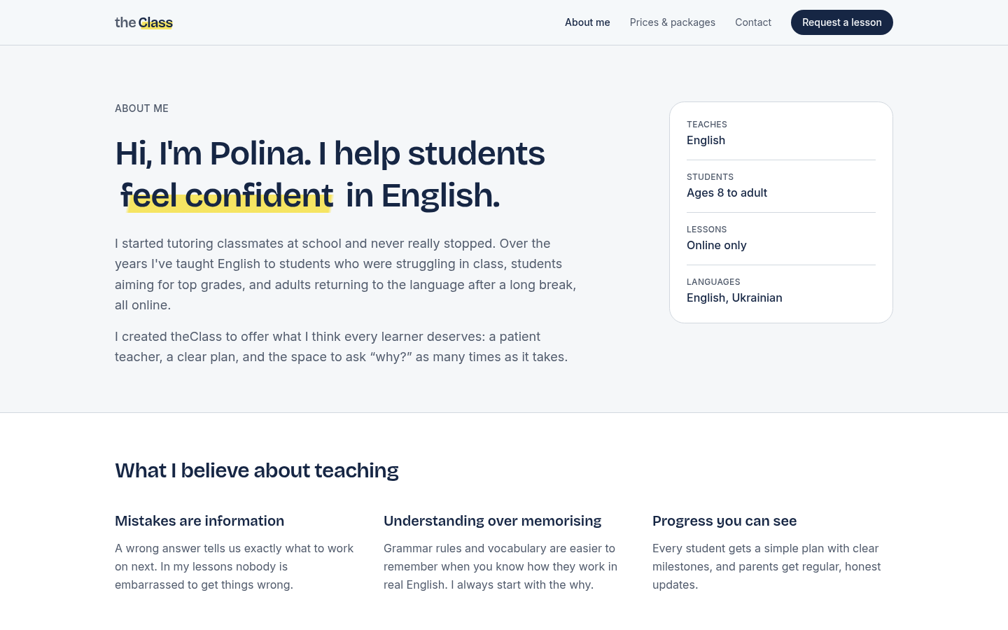
A quick-scan card shows what Polina teaches, who, where, and in which languages. Prices sit on their own page and are previewed on the home page, with an FAQ below.

theclass.space/about
theClass About me page with a fact card: English, ages 8 to adult, online only, English and Ukrainian
theclass.space/pricing
theClass prices page with single lesson, monthly plan and term package cards

Contact: one short form, one promise

Direct contact details sit next to the request form, with a clear promise of a reply within one working day. This addresses the slow-reply frustration from research.

theclass.space/contact
theClass contact page with email, phone, hours, and the lesson request form
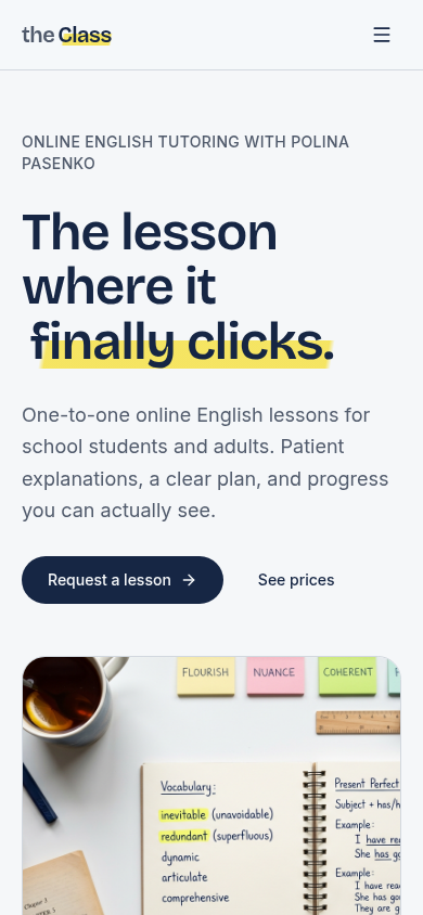
theClass home page on mobile

Review rounds and an end-to-end form test.

I reviewed each version and tested the request form from submission to a saved row in the database. Validation correctly blocked a request without a package, so every lead arrives with a plan attached.

4

feedback rounds

2

form fields removed

  • Copy and the form assumed several subjects, but Polina only teaches English.

    Rewrote the copy for English only and removed the Subject field.

  • The form asked for a lesson format, but every lesson is online.

    Removed the field and stated “Online only” on About and Contact.

  • The languages list included Russian, which Polina doesn’t speak.

    Languages now read English and Ukrainian.

  • The hero photo showed a notebook of maths equations.

    Replaced it with an English vocabulary notebook and sticky notes.