All work

Nytka

Designing an online shop for Ukrainian embroidered clothing that feels like contemporary fashion, not a museum.

nytka.store
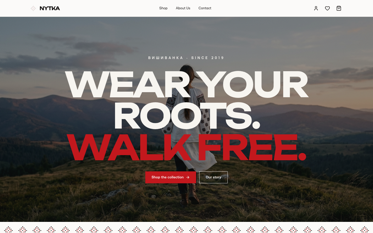
Nytka home page with the headline Wear your roots. Walk free.
Role
UX research, UX & UI design
Platform
Responsive web
Pages
Home, Shop, Product, Cart, About, Contact, Account
Tools
Framer, Figma, Next.js, Tailwind CSS

Overview

Heritage clothing is hard to shop online. Nytka sets out to fix that.

The vyshyvanka is one of Ukraine's strongest symbols of identity. Most stores that sell it look like souvenir shops: cluttered pages, generic categories, and no context about where a pattern comes from. I designed Nytka end to end, from research to a working, responsive storefront.

01 · Discover

Research: who buys a vyshyvanka online, and what stops them?

  • 6

    User interviews

    With diaspora and Ukraine-based shoppers aged 22–45.

  • 48

    Survey responses

    Covering buying habits, trust, and price expectations.

  • 5

    Competitor audits

    Covering heritage stores and minimal fashion labels.

Key insights

I used affinity mapping to cluster interview notes and survey answers into four recurring themes.

  1. 1

    Shoppers pick a vyshyvanka by region and pattern meaning, but stores only filter by size and colour.

  2. 2

    Busy, ornamental interfaces made products feel cheap and hard to compare.

  3. 3

    People wanted to know the story behind a piece before paying a premium for it.

  4. 4

    Many buyers wanted their purchase to support Ukraine, but couldn’t verify that it did.

02 · Define

One persona and one clear problem to solve.

Persona

Olena, 29

Designer, living in Berlin

“I want a vyshyvanka from my grandmother’s region that I’d actually wear to work. I don’t know where to find one, and I can’t tell what’s authentic.”

Goals

Authentic regional pieces, modern cuts, buying that gives back.

Frustrations

Cluttered stores, no context, unclear quality and origin.
How might we

…help shoppers find a vyshyvanka by its region and story, in an interface as calm as a modern fashion label?

  • Make region a main way to filter
  • Tell every product's story
  • Let the clothes, not the decoration, carry the page

03 · Ideate

Information architecture and the main user flow.

  1. Home
  2. Shop
  3. Filter by region
  4. Product + story
  5. Cart & favourites
  6. Checkout

Card sorting

Five participants grouped 30 products. Most sorted by region before garment type, so region became a top-level filter.

Lean navigation

Three main links (Shop, About, Contact) plus account, favourites, and cart icons keep attention on the products.

Low-fi wireframes

I sketched three filter layouts: top bar, sidebar, and slide-over drawer. The drawer kept the grid full width on every screen size.

04 · Design

A quiet system, borrowed straight from the thread.

Linen

#F8F7F3

Ink

#272524

Embroidery red

#B8322A

Type & ornament

Аа Nn

Three colours from black-and-red cross-stitch, one wide display face with full Cyrillic support, and a single row of stitched diamonds as the only decoration in the interface.

Shop: browse by region, not just by menu

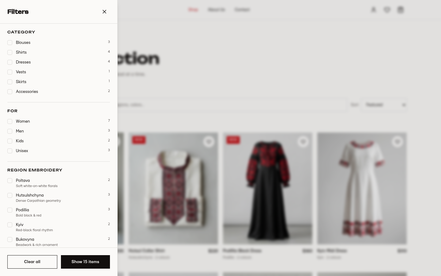
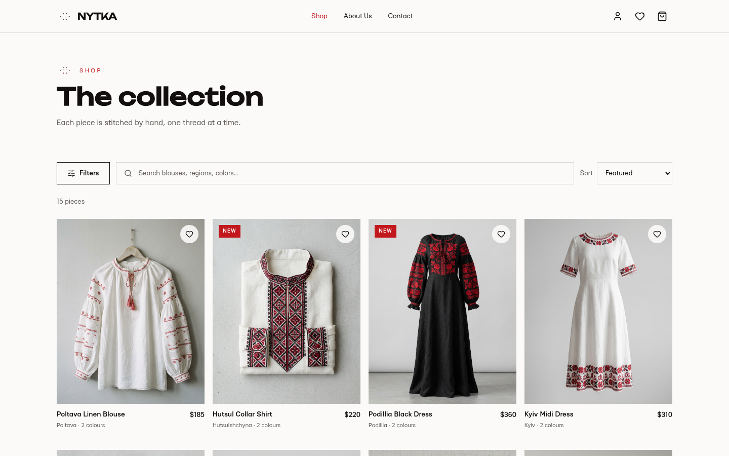
The slide-over drawer filters by category, who it's for, and regional embroidery. Each region has a one-line description of its style.

nytka.store/shop
Nytka shop grid with search, filters and sort
nytka.store/shop
Nytka filter drawer with category, gender and regional embroidery options

Product: every piece has a story

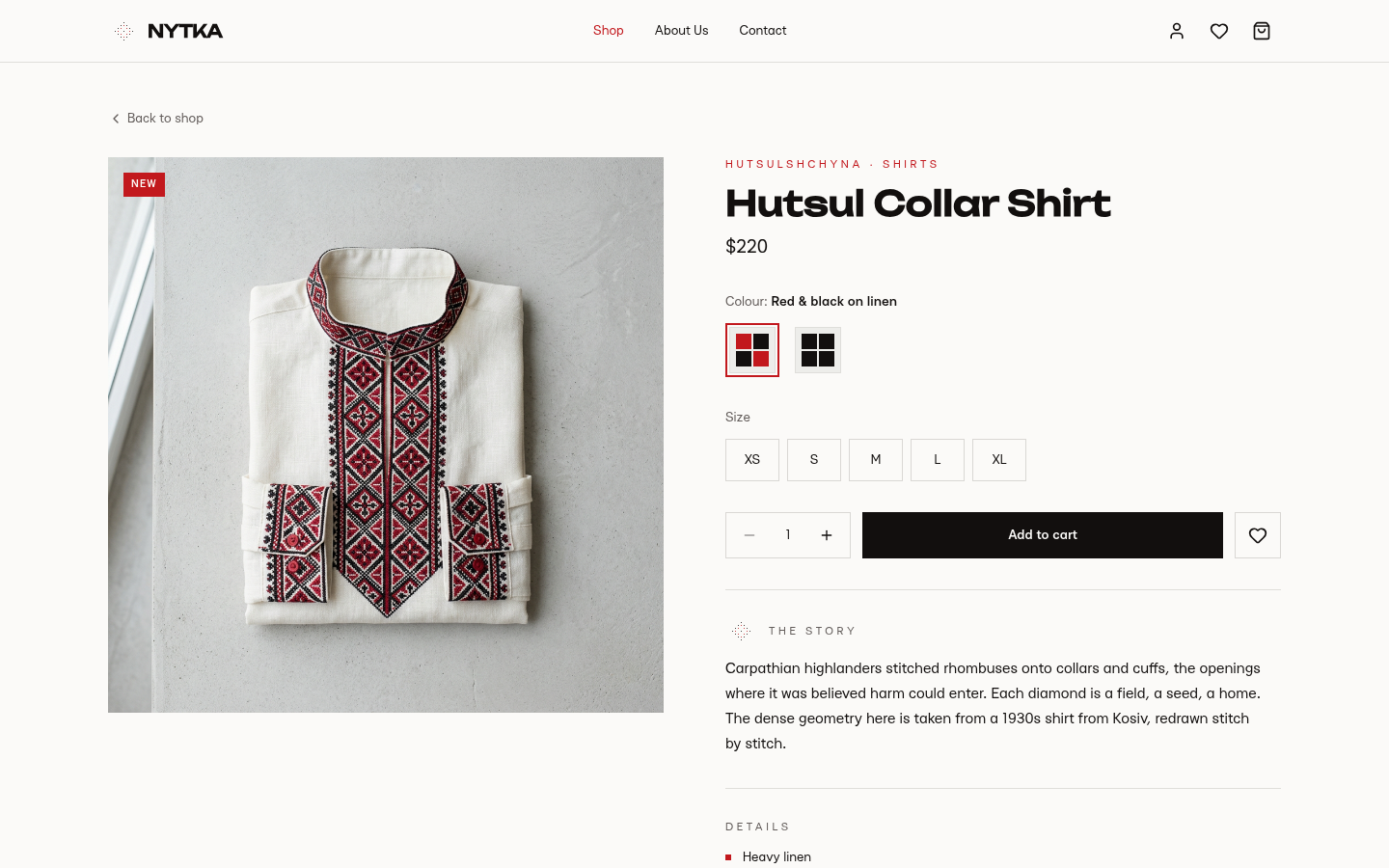
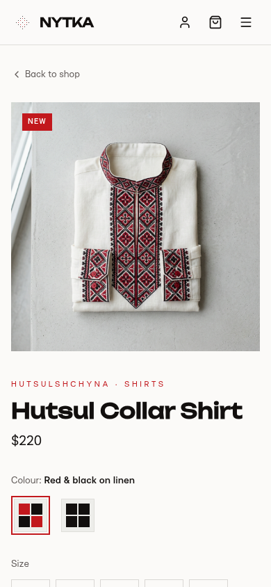
Colour and size selection sit above a short story about where the pattern comes from, which addresses the trust gap from research.

nytka.store/shop/hutsul-collar-shirt
Nytka product page for the Hutsul Collar Shirt with colour, size and the story of the pattern
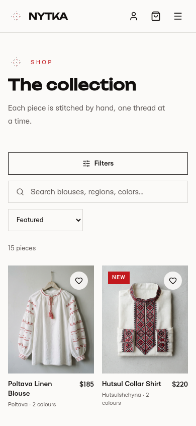
Nytka product page on mobile

05 · Test & iterate

Usability testing with five participants.

Moderated sessions on desktop and mobile. Task: find a Hutsul-style shirt under $250 and add it to the cart.

5/5

completed the task

<90s

avg. time to cart

  • Testers didn’t know what the regional filter names meant.

    → Added a one-line style description under each region.

  • Testers lost track of saved items when they moved between pages.

    → Put favourites in a tab inside the cart, next to the bag.

  • The 10% donation was easy to miss.

    → Showed it as its own line in the order summary.